A/B Testing Mistakes That Produce False Conversion Wins
Statistical false positives are drowning your test results in noise, not signal.
Only 22% of A/B tests produce a statistically significant winner. That means the overwhelming majority of "wins" your team celebrates in a Slack channel somewhere are built on noise, not signal. This piece is about the five specific, repeatable mistakes that turn ambiguous data into false confidence, and why naming each one is the only real defense you have.
The gap between "the test said we won" and "the win held in production" is where optimization programs quietly lose their credibility. Nobody announces this gap out loud. It shows up six months later when someone asks why the redesigned checkout flow, the one that tested at a 12% lift, is now converting at roughly the same rate as the old one. The honest answer is usually some version of "we made a mistake we didn't know we were making," and that's the part worth fixing.
None of the five mistakes below are random. They're behaviors teams repeat test after test, usually because the tooling makes the behavior easy and the business pressure makes it tempting. Each one has a name, a mechanism, and a specific way it dresses up a bad result as a breakthrough.
Peeking at results early and stopping when the numbers look good
Roughly 47% of teams check results daily and stop the test the moment things look good. It's the most common statistical mistake in the industry, and it's also the most understandable one, because dashboards are right there, refreshing in real time, practically begging to be checked.
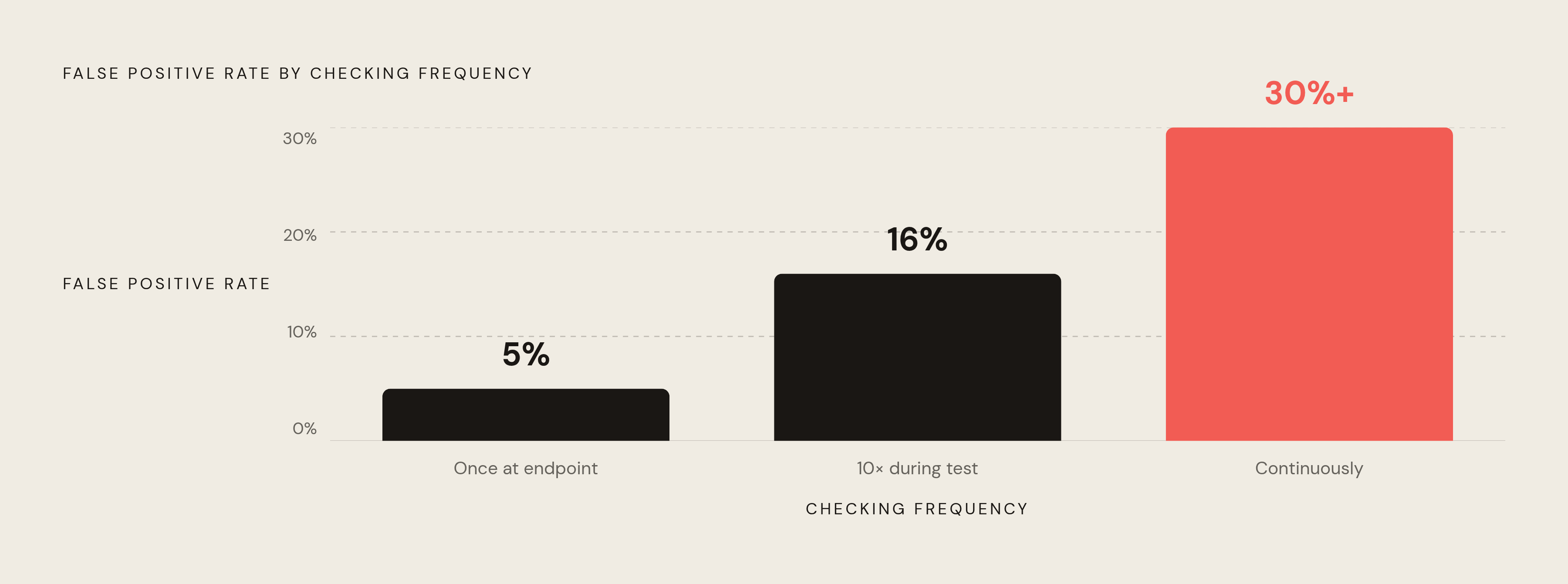
Here's the mechanism. Every time you check a live test for significance, you're running a fresh hypothesis test. Do that once, at a predetermined endpoint, and your 5% false positive rate holds. Do it ten times over the course of a test and that rate climbs to around 16%, more than tripling the risk you think you're taking. Monitor continuously, the way most dashboards invite you to, and the false positive rate can push past 30%. Evan Miller's analysis on this is blunt about it: what you think is a 1% significance threshold under repeated peeking is actually behaving like a 5% threshold. You're not more confident. You're just checking more.
The A/A test is the proof that should make everyone uncomfortable. Researchers ran 1,000 A/A tests, meaning the exact same experience was shown in both arms, no variant, no difference, nothing to detect. And 771 of those tests still reached 90% statistical significance at some point during the run. Not because anything worked. Because if you check enough times, random noise eventually looks like a signal, and if you stop right there, you'll swear you found something.
Statisticians have a name for this: p-hacking. It's been documented since the 1950s, which tells you something important. The tooling got faster, the dashboards got prettier, but the underlying error didn't go anywhere. It just got easier to commit by accident.
The fix is almost insultingly simple: decide your sample size and runtime before the test launches, and don't look at significance until both conditions are met. Not "check but don't act." Don't look. The temptation is the whole problem, so remove the temptation.
Ending tests before enough people have seen each variant
This is the mistake's close cousin, and teams conflate the two constantly: stopping when a significance threshold gets hit rather than when the pre-planned sample size is reached. Those are not the same stopping rule, even though they feel identical in the moment.
Tests that run under 14 days carry a 61% false positive rate. For context, the median well-run test in benchmark data runs about 23 days. That's not a small gap; it's the difference between a test that captured a full behavioral cycle and one that captured a fraction of a week and called it a verdict.
The sample size math surprises people more than it should. Say you've got a page converting at 4%, and you want to detect a 20% relative lift. You need roughly 4,000 visitors per variation, 8,000 total, before the numbers mean anything. Want to detect a smaller, more realistic 10% lift on that same page? Now you need about 16,000 per variation. Most teams underestimate this because they anchor on the absolute conversion number in front of them, not on the statistical power required to trust it.
There's a "winner's curse" hiding in underpowered tests too. When a test doesn't have enough data, the apparent uplift in the declared winner tends to run systematically larger than the true long-run effect; simulations suggest early estimates from underpowered studies get inflated by 25% to 50%. So that five-day test showing an 8% lift isn't a modest win you can bank on. It's an untrustworthy number that could be anywhere from negative to slightly positive once reality catches up to it.
Archie Abrams, Shopify's VP of Product and Head of Growth, offered a useful heuristic in a 2025 interview: look for double-digit changes in conversion rate. Large effects are unlikely to be pure noise. Small effects, even when technically real, rarely move the business enough to justify the risk of acting on them too early. It's a filter worth adopting, if only because it forces you to ask whether the win you're excited about is actually big enough to matter.
The 14-day floor isn't arbitrary either. It exists partly to capture a full weekly behavioral cycle: weekday shoppers behave differently than weekend browsers, and a test that misses that cycle isn't measuring your audience. It's measuring a slice of it and mistaking the slice for the whole.
Running multiple tests or metrics simultaneously without adjusting for it
Test 20 hypotheses at the standard 0.05 significance level, and you've got a 64% probability of at least one false discovery, according to MCP Analytics, even if every single hypothesis you're testing is false. Run enough tests, and something will look like a win purely by chance. That's not pessimism. That's arithmetic.
This mistake shows up in three flavors, and most teams have committed all three without realizing it. First, testing multiple metrics at once (clicks, signups, revenue) and reporting whichever one happened to move. Second, running several variants against a single control and surfacing only the best performer, ignoring that "best of five" and "genuinely better" are different claims. Third, and sneakiest: post-hoc segment analysis, where you slice the data after you've already seen it, hunting for the audience where the variant "worked."
That third one deserves its own cautionary story. A test might show a flat, unremarkable 0.5% overall improvement, the kind of result nobody gets excited about. But dig into the segments and you might find a 15% uplift for mobile users sitting right next to a 10% drop for desktop. Ship the "winner" based on the flat topline number, and you've just quietly hurt a segment you never bothered to inspect. The overall metric lied to you by averaging two opposite stories into one boring one.
The standard fix is the Bonferroni correction: divide your desired significance level by the number of tests you're running (α/m). Run 20 metrics at α = 0.05, and your corrected per-metric threshold drops to 0.0025. It's a blunt tool, and it comes with a real tradeoff: Bonferroni is conservative, which means it cuts false positives but also makes it harder to detect effects that are genuinely real. Know that going in, or you'll wonder why nothing seems to hit significance anymore.
The practical discipline is boring but it works: define your primary metric, your secondary metrics, and your key segments before the test launches. Anything you didn't pre-specify is exploratory. You can look at it, you can get curious about it, but you shouldn't act on it as if it were conclusive, because it isn't.
Mistaking the novelty spike for a genuine conversion improvement
Here's a fun one. The novelty effect happens when users click or convert on a new variant simply because it's different, not because it's actually better. A brighter button, a reordered layout, a new onboarding screen; all of it catches the eye the way anything unfamiliar catches the eye, and none of that attention is guaranteed to last.
What makes this genuinely dangerous is that novelty-driven results are statistically significant. They look identical to real improvements in the dashboard. The test isn't broken; your conclusion about the test is. That distinction matters, because it means you can run everything correctly, follow every rule in this piece, and still walk away with the wrong answer if you stop at the wrong moment.
The decay is usually predictable, if you know to look for it. Once returning visitors habituate to the new design, typically within one to three weeks, the engagement boost tends to evaporate. A result that looked like a 12% improvement in week one can converge toward zero as behavior settles back into old patterns. High-traffic sites face an almost cruel irony here: the faster you reach statistical significance, the more likely you are to declare a winner before novelty has had time to wear off. Speed, which is supposed to be an advantage, works against you in this one specific case.
There's a mirror image worth knowing too: the primacy effect. Returning users sometimes perform worse under a new design at first, simply because they have to re-learn paths they used to navigate on autopilot. This drags measured lift downward early on, then recovers as people adjust, meaning a real improvement can look weak or marginal right out of the gate. So novelty inflates results and primacy deflates them, and both are lying to you in opposite directions.
The diagnostic is straightforward once you know to run it. Segment results by new versus returning visitors. A genuine improvement holds a stable daily effect across both groups. A novelty-driven result shows a declining trend among returning visitors, high in week one, drifting toward zero afterward, while new visitors might show a flat or stable effect throughout. Adobe's official experimentation guidance backs this segmentation approach, and it's worth building into your standard review process rather than pulling out only when a result feels suspicious.
This is also why the 14-day minimum test duration is doing double duty. It's not just about weekly behavioral cycles. It's giving novelty enough runway to decay before anyone gets to declare victory.
Ignoring sample ratio mismatch and trusting biased traffic splits
A Sample Ratio Mismatch, or SRM, happens when the traffic split you actually observe differs meaningfully from the split you configured. You set up a 50/50 test and the data comes back looking like 54/46, or worse. That's not a rounding error to shrug off. It's a sign that something upstream broke the randomization your entire test depends on.
Why does this produce false wins? Because SRM breaks random assignment at its root. If one arm ends up with a systematically different population than intended, whatever difference you measure between variants might have nothing to do with the variant itself. It might just reflect who ended up in which bucket, which is a much less interesting finding dressed up as a much more interesting one.
The causes are often invisible unless you're specifically looking for them. Bot filtering that disproportionately strips users from one variant. Redirect-based implementations that drop users mid-transit before assignment even sticks. Browser caching serving up stale assignments. Concurrent experiments quietly interacting with the same bucketing logic. Even something as mundane as page load speed differences, where the slower variant bleeds users to bounce before their assignment ever registers.
Microsoft's case study on this is worth knowing by name. A test showed decreased engagement and failed its SRM check right away; the observed counts in each arm didn't match the configured ratio. On investigation, it turned out the variant was engaging enough to trigger bot detection filters, which then quietly removed those users from the analysis. Once the team corrected for it, the result flipped entirely, from a loser to a winner. Same data, same test, opposite conclusion, all because nobody checked the ratio first.
That's the core lesson: SRM is a diagnostic check, not a measurement outcome. It has to run before you evaluate significance, not after you've already gotten excited about a number. Detection itself isn't exotic; a chi-square test on observed versus expected assignment counts does the job, and most mature experimentation platforms flag this automatically. Teams using lighter-weight tools need to build that check themselves, and skipping it is how you end up trusting a result that was broken before the test even started.
What these mistakes share and how to run tests whose winners actually hold
Look back across all five, and a pattern emerges that's easy to miss when you're inside any single one of them. Every mistake here involves making a decision at the wrong moment: too early, with peeking; with too little data, in underpowering; across too many hypotheses without adjusting for it, in multiple testing; before novelty has decayed; or without checking whether the underlying data was even trustworthy in the first place, with SRM.
The fix underneath all five fixes is the same thing: pre-commitment. Decide, before the test launches, what you're measuring, how long you'll run it, what traffic split you expect, and what would actually count as a valid result. Every mistake in this piece is essentially what happens when those decisions get made after the data has already started talking to you, because data is persuasive, and persuasive is not the same as true.
A conservative estimate puts the false positive rate among "winning" tests, in programs that peek regularly, at around 30%. That's not a rounding error. That's roughly a third of a team's optimization effort producing zero real value, dressed up as progress the whole time.
And the cost isn't just wasted testing cycles. It's shipping variants that quietly hurt users you never segmented for. It's building a product roadmap on evidence that was fabricated by bad statistics rather than discovered by good ones. It's the slow erosion of trust in the testing program itself, the moment leadership notices that shipped "winners" keep failing to perform the way the dashboard promised.
Content experiments aren't exempt from any of this, by the way. Headline tests, CTA variants, landing page copy; a content "winner" declared after four days on a low-traffic page carries every failure mode described above. Novelty applies to headlines just as much as it applies to buttons. Underpowering applies to a landing page with 200 daily visitors just as much as it applies to a checkout flow with 20,000.
So treat any test result as a hypothesis to validate, not a fact to ship. A winner that can't survive a second confirmatory test probably wasn't a winner to begin with; it was a number that looked convincing at the wrong moment, checked by the wrong method, on a sample that was never big enough to say anything with confidence. Teams that know terms like "peeking" and "SRM" by name can catch these errors in QA, in test review, before they ever reach a roadmap. Teams that only know "be rigorous" as a value statement have nothing concrete to check against, and rigor without a checklist is just a good intention with a deadline attached.