Conversion Rate Optimization Strategies for Content-Led Sites
Track micro-conversions separately from demos to optimize each funnel stage correctly.

The first mistake most content teams make is treating conversion as a single event: someone either requested a demo or they didn't. That framing collapses two different categories of outcome into one useless scorecard.
Macro-conversions are the terminal goals: demo requests, purchases, sign-ups. Micro-conversions are the earlier signals: email captures, PDF downloads, newsletter subscriptions, scroll depth past a meaningful threshold. Micro-conversions run several times higher in frequency than macro-conversions. The real question is whether those signals are being captured and nurtured at all, or simply evaporating into the ether.
Why does this matter practically? Because it changes what "performing correctly" looks like at each stage. A top-of-funnel blog post generating email signups in the low single digits is not underperforming. It is doing exactly what it should. Benchmarking that post against demo request rates misunderstands the job entirely, in the same way you wouldn't fault a roadside billboard for failing to close a sale.
Content stage maps to reader intent, and reader intent determines the appropriate conversion goal. Without that alignment, you are not optimizing a funnel; you are optimizing noise and calling it strategy.
Top-of-funnel content: converting curiosity into a relationship
Top-of-funnel content is the entry point: "what is" posts, beginner guides, trend roundups, opinion pieces. These pages capture search and social traffic from readers who are curious but not yet evaluating anything. The appropriate conversion goal here is the micro-conversion, usually an email address or a newsletter subscription.
One finding that deserves more operational weight than it typically receives: content written at a fifth-to-seventh-grade reading level achieves measurably higher median conversion rates than more complex prose. The mechanism is not that simpler content is better content; it is that clarity reduces cognitive friction before the CTA even appears. A reader who had to work to understand the article is already fatigued by the time you ask for their email. Almost too obvious when you say it out loud.
The lead magnet question is where most TOFU strategies quietly collapse. Generic site-wide ebooks and catch-all newsletters convert in the low single digits. Content upgrades, offers tightly matched to the specific post the reader just finished, consistently outperform them by a wide margin. The logic is almost embarrassingly simple: a reader who just finished an article on topic X is among the warmest possible audiences for a deeper resource on topic X. Checklists, cheat sheets, and concise templates convert better than comprehensive guides for a first ask. The first ask should not feel like homework.
Quizzes and diagnostic tools consistently outperform passive content on conversion metrics, and not for mysterious reasons. A quiz that identifies a reader's specific problem is simultaneously a lead magnet, a segmentation tool, and the beginning of a personalized nurture sequence. The form data and quiz-response data together tell you not just who opted in, but what they actually care about. That is more actionable intelligence than a generic email capture, and it costs the reader nothing extra to provide it.
How form design and offer framing determine whether a TOFU conversion happens
A reader has decided they want the thing. The form is the last step. This is where a surprising proportion of conversions die quietly, and usually for reasons that are entirely preventable.
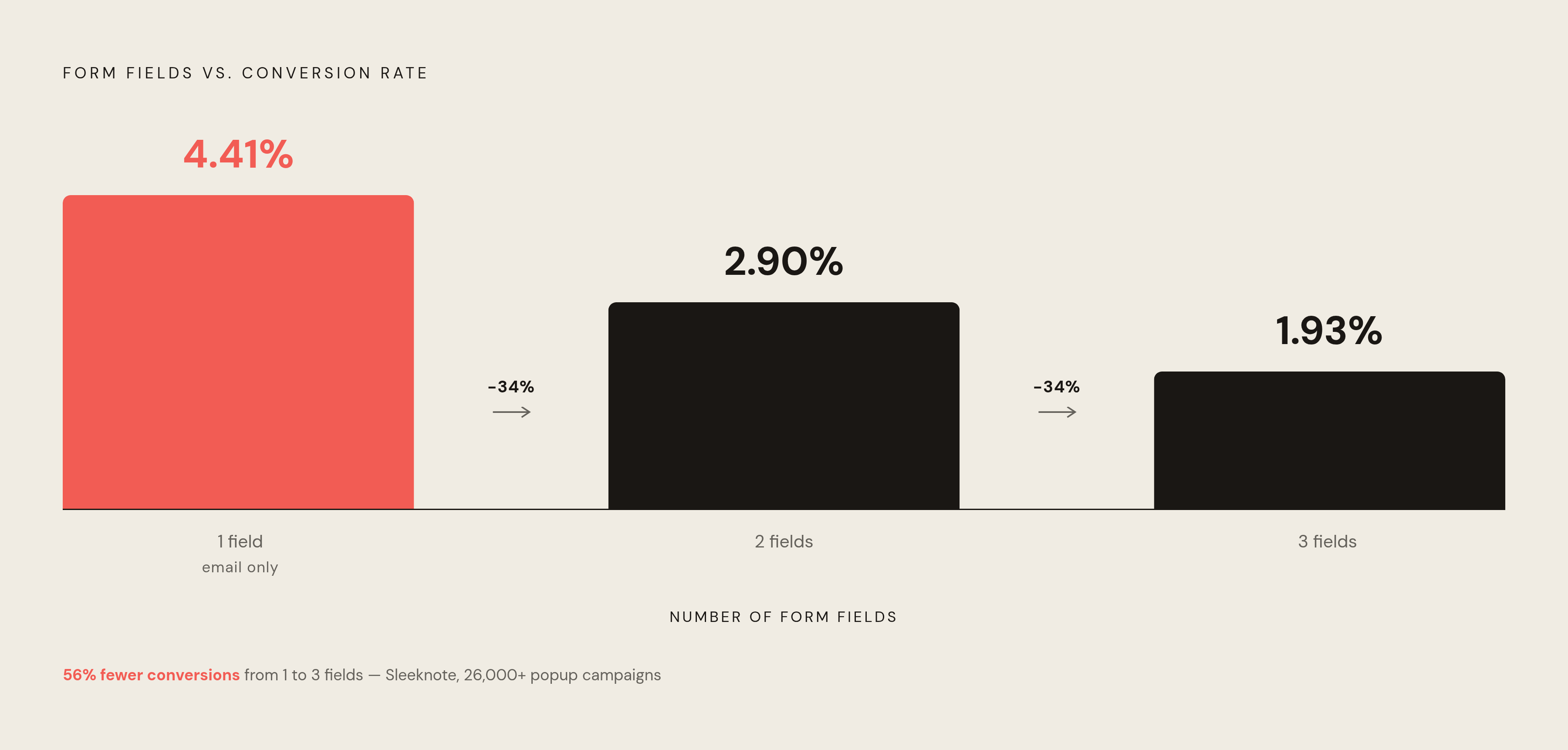
Sleeknote's study of over 26,000 popup campaigns found that a single email-field form converts at 4.41%. Adding a second field drops that to 2.90%. A third field drops it further to 1.93%. Each additional field roughly halves conversion momentum. First name plus email is often the maximum tolerable ask from a cold content visitor; in many contexts, just the email is better.
But what if the form is already minimal and the conversion still underperforms? Then the problem is almost certainly offer framing. "Get the 5-step checklist for X" outperforms "Download now" not because it is longer but because it is specific. Specific language signals that the offer is real, bounded, and directly relevant. Generic language signals the opposite. Lead with what the reader gets, not what they have to give.
A passive form presents a transaction: give us your email, receive a thing. An interactive quiz presents an experience: answer these questions, get a personalized result. The perceived value exchange is different, and the conversion data reflects that. For content sites trying to lift TOFU capture rates without substantially increasing budget, interactive lead magnets are one of the highest-leverage levers available. The investment is front-loaded; the compounding is ongoing.
Middle-of-funnel content: converting engaged readers into qualified prospects
Middle-of-funnel content is where intent sharpens. Comparison posts, how-to guides, use-case articles, deep-dive explainers, case study roundups: these attract readers who are narrowing options, not just satisfying curiosity. They already understand the category. Now they are evaluating fit.
The appropriate conversion goals shift accordingly: webinar registrations, access to calculators or tools, newsletter upgrades, gated case studies, or soft signals of demo interest. Case studies and user reviews perform strongly at this stage, which tells you something about what the reader actually needs at this point. Evidence that the thing works, not just explanation of how it works.
Interactive tools are particularly effective here for a structural reason. A calculator that shows a reader their potential ROI is not just a conversion mechanism; it is a proof of concept for the solution itself. If the calculation is credible and the output is relevant, the tool does sales work before any sales conversation begins. One well-designed calculator embedded across a cluster of related content pages can generate returns that dwarf the cost of building it.
CTA placement works differently at MOFU than at TOFU. Readers arriving at a comparison guide usually have a specific question driving their visit. Placing the CTA above the fold, before they have received any value, asks them to act before they have been given a reason to. CTAs placed at natural resolution points in the content, after a comparison table, at the end of a how-to section, following a data point that confirms something the reader already suspected, outperform premature placement. The reader needs to feel informed before they can feel ready.
A MOFU reader who senses the content is engineered to capture them rather than help them will discount the brand behind it. Trust is the conversion mechanism. The CTA is just the door.
Bottom-of-funnel content: removing the last obstacle to conversion
Bottom-of-funnel content is different in character from everything above it. Product comparison pages, detailed case studies, pricing explainers, FAQ pages, demo request pages: these attract readers whose intent is decisional. They are not gathering information. They are managing risk.
That distinction changes everything about how conversion mechanisms should be designed. The primary barrier at this stage is not a lack of information; it is fear of a wrong decision. Social proof placed inline with the CTA, customer logos, testimonials, review counts, addresses that fear directly. Specificity in the offer reduces ambiguity: "30-minute strategy call" is less threatening than "Contact us," because the reader knows exactly what they are agreeing to. Tell the reader what happens after they click.
CTA strategy also changes at BOFU. Above-the-fold placement and repeated CTAs are appropriate here in a way they are not at earlier stages; the reader arrived with an opinion already forming. They do not need to be warmed up. They need to be met where they are.
Exit-intent popups serve a distinct role at the bottom of funnel. Research on popup campaigns shows an average email-capture rate around 4.64% for exit-intent triggers; scroll-triggered popups on content-rich pages outperform time-triggered ones. Triggering after 30 to 60 seconds of genuine engagement is appropriate; triggering on arrival confirms whatever skepticism the reader brought with them. The popup should offer something that addresses the reason the reader is leaving, not just the same CTA they already ignored.
Content-led sites competing in "best of" and comparison searches are doing BOFU work whether they realize it or not. The article itself must position the brand as a credible option. A roundup that earns its recommendation through specificity and evidence converts better than one that reads like a paid placement, because readers have become very good at detecting the difference. They will not tell you; they will just leave.
CTA placement and format across the full content page
No single CTA placement wins universally. Anyone selling you a "proven" placement formula is selling you their context, not yours.
Above-the-fold CTAs are appropriate for BOFU pages and high-intent landing pages. On long-form TOFU and MOFU content, they are often premature; the reader has not yet received enough value to feel motivated to act. Inline text-based CTAs deserve more credit than they typically receive in these conversations. Research suggests they frequently outperform button-style or popup CTAs on blog content, partly because of banner blindness. Readers have been conditioned to ignore visual interruptions but still read sentences. A CTA embedded in a sentence can be more visible, in the practical sense of actually being seen, than a brightly colored button sitting in a sidebar.
End-of-content CTAs capture readers at peak engagement. The moment someone finishes an article is the moment they are most open to a next step; they just received the value and the transaction is still live in their attention. Natural pause points within the content are also productive placements, after a key section, following a data point that lands, at the bottom of a numbered list, because the reader surfaces briefly before continuing.
Sidebar CTAs perform differently by device. On desktop, they are visible and persistent without interrupting reading flow. On mobile, they collapse or disappear entirely. Any conversion strategy built substantially on sidebar placements is largely invisible to a large portion of most content sites' audiences. Mobile traffic is not a niche consideration anymore; it is often the majority channel, and it is the one sidebar CTAs fail silently on.
Multiple CTAs are not the same as repeated identical CTAs. A well-structured long-form post can carry a different offer at each natural stage of the content, matched to where the reader is in their understanding at that moment. That is not aggressive. That is just paying attention.
Page speed as a silent conversion tax on content sites
Page speed is not a technical concern that occasionally touches conversion. It is a conversion variable that happens to require technical work, and that distinction matters enormously for how it gets prioritized inside an organization.
Content sites are especially vulnerable here because organic and social traffic skews heavily mobile. Mobile users abandon sites that take longer than three seconds to load, and every content site I have audited with heavy image embeds and unoptimized fonts routinely exceeds that threshold without anyone in the marketing organization noticing; they are testing on fast desktop connections, which is a bit like a restaurant owner only ever eating in the kitchen.
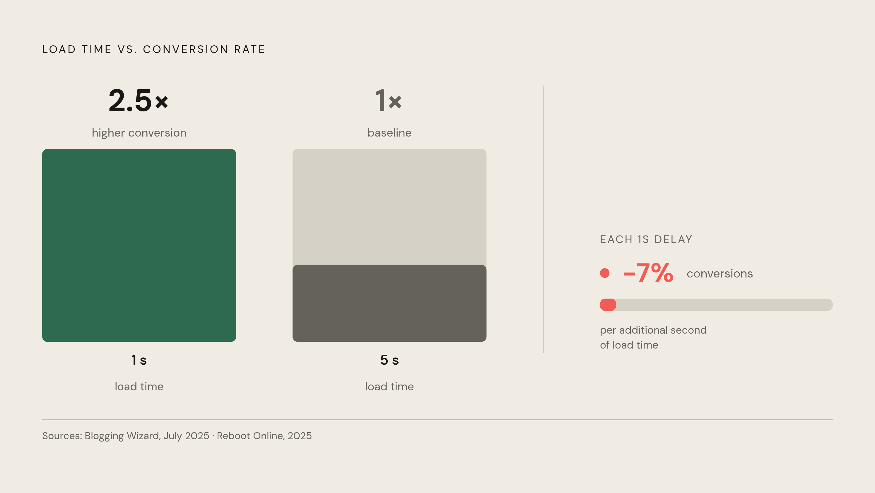
The data on speed and conversion is consistent in direction even where precise figures vary by study. Reboot Online's 2025 research found that a one-second delay in load time reduces conversions by roughly 7% and page views by roughly 11%. Sites loading in one second convert at approximately 2.5 times the rate of sites taking five seconds to load, per Blogging Wizard's July 2025 analysis. The cumulative cost of a slow content site is not a single lost conversion; it is a consistent percentage shaved from every session across every post, indefinitely.
Vodafone and Yelp have both reported meaningful conversion improvements following Core Web Vitals optimization. Speed work is not dev hygiene; it is revenue work. Only around 42% of mobile sites pass all three Core Web Vitals, which suggests the competitive opportunity here is still substantially uncaptured for most content operations.
Image compression, lazy loading, and font optimization are not glamorous. They do not show up in conversion strategy decks as often as lead magnets and CTA copy do. But every 100 milliseconds of reduced load time has measurable downstream effects on the conversion rates that all the other work is trying to improve. Spending significant effort optimizing CTAs on a slow site is a bit like refinishing a door that doesn't open.
Personalization and AI-assisted optimization for content sites at scale
Most content operations treat personalization as an afterthought, which is a curious choice given that it is one of the more direct ways to resolve the intent-mismatch problem at scale.
McKinsey's research has found that companies executing personalization well drive substantially more revenue than competitors who do not. The mechanism is the same one that makes content upgrades outperform generic lead magnets: relevance reduces friction. Readers convert at higher rates when you show them something that actually applies to them. This is not a sophisticated insight. It is just not implemented as often as it should be.
Behavioral personalization on content sites means showing different CTAs or offers based on what a reader has already consumed, where they came from, or how they have behaved on the current page. A reader arriving from a specific search query should see a content upgrade matched to that query, not a site-wide generic offer. A returning visitor who already downloaded a TOFU asset should see a MOFU offer on their next visit, not the same ebook they already have. That raises an important question: if these are not exotic capabilities, why do most content operations still not implement them? Every startup I know that has dug into this finds the answer is organizational, not technical.
AI-referred traffic deserves separate tracking. BrightEdge's 2025 research found that traffic referred from AI tools converts at roughly 4.4 times the rate of traditional organic traffic. Blending it with standard SEO traffic obscures the performance of both channels. If you are not segmenting this in your analytics, you are making decisions about organic performance using a blended number that increasingly does not represent either channel accurately.
One important caveat: personalization without a coherent content strategy behind it just serves irrelevant content faster. The stage framework has to exist first. AI-assisted optimization scales the strategy; it does not substitute for having one.
Testing and iteration: how to know which changes actually worked
The global average conversion rate across websites sits around 2.35%. One in four sites converts at more than twice that rate. One in ten converts at nearly five times that rate. The gap between average and top performers is largely explained by systematic testing, not superior initial intuition. That should be either encouraging or humbling, depending on where you currently sit.
Start with CTA copy and placement on your highest-traffic posts. These are the pages where a small lift compounds most rapidly across sessions. Then test content upgrade relevance: is the offer actually matched to the post's topic and the reader's intent, or is it close enough that you have been assuming it is fine? Then test form field count. The Sleeknote data makes the first experiment here almost self-selecting: if your highest-traffic TOFU forms have more than two fields, reduce them and measure the result.
Popup timing and trigger type are worth systematic attention because the performance spread between average and top-performing configurations is wide. Scroll-triggered popups on content-rich pages outperform time-triggered ones, but the optimal scroll depth varies by content length and topic. That is a testable hypothesis, not a universal rule, and treating it as a universal rule is precisely how conversion strategies calcify into dogma.
But what if the tests fail to produce a clear winner? That is usually a signal that traffic volume is insufficient for statistical significance, not that the variable being tested does not matter. Every small content site I work with faces this constraint more often than they admit. In those cases, prioritize changes with clear mechanistic logic, fewer form fields, more specific CTA copy, faster load times, where the directional evidence from external research is strong enough to act on without waiting for local significance. Sometimes you have to borrow conviction from other people's data until you have enough of your own.
The sites that compound conversion gains over time are the ones treating every high-traffic post as an ongoing experiment, not a finished artifact. Finished is a dangerous word in content.