Conversion Rate Benchmarks by Industry and Channel
Understanding what sits behind published conversion benchmarks matters more than the number itself.
This piece looks at what conversion rate benchmarks actually measure, not just what number they report. Before you hold your store's rate up against any published average, you need to know the denominator, the scope, and the definition of "conversion" sitting behind that number, because those three things shift so much from dataset to dataset that the same label ends up meaning entirely different things. Keep that filter on and walk through the numbers section by section with me.
The standard formula and where it breaks down in practice
Nobody argues about the math: conversions divided by sessions, times 100. The argument starts over what you're allowed to put into each side of that equation.
Most industry datasets count sessions in the denominator, not people, and that swap matters more than it sounds like it should. Switch to unique visitors instead and your reported rate can jump 2x to 3x, just because one person browsing on their phone at lunch and again on their laptop that night generates two sessions but counts as one visitor. Pull your own store's numbers on a per-visitor basis, then line them up against a sessions-based industry benchmark, and you haven't found a performance win. You've found a math error wearing a performance win's clothes.
There's also a mess sitting inside the sessions themselves. Bot traffic and single-page bounces inflate session counts. Plenty of published benchmarks filter that junk out before publishing; plenty of raw GA4 setups a store owner is running right now don't. So you might be comparing a scrubbed number to a dirty one and never know it happened. Multi-touch journeys make it worse. A customer browses Monday, compares prices Wednesday, buys Friday: which of those three sessions gets credit for the sale depends entirely on which attribution model you asked. Different models answer that question differently, and whatever benchmark you're reading already picked an answer without telling you which one.
A category mismatch complicates things too, one that gets glossed over more than it should. A "conversion" in B2B lead gen usually means a form fill, a top-of-funnel action. A "conversion" in ecommerce means a completed purchase, the last step in the funnel, not somewhere in the middle of it. Calling both of those "conversion rate" and stacking them on the same chart treats a phone number and a paid invoice as the same event.
Fashion retail makes a good stress test here. A reported conversion rate around 2.4% looks fine, maybe even a little above par next to most industry averages. But apparel return rates can run past 30%, meaning a real chunk of those "converted" sessions get unwound weeks later when the jeans don't fit. The number that actually tells you whether the business is healthy is net conversion: purchases that stay purchased. Almost nobody publishes that figure. So the benchmark sitting in front of you can be technically accurate and still lead you somewhere wrong.
The fix isn't glamorous. Write down your conversion event in plain words before you open any comparison table, check that your denominator matches the source you're measuring against, and strip out bot traffic and bounce inflation wherever you can see it. Do that first. Only then does stacking your number against someone else's mean anything at all.
Ecommerce conversion rates by product category
The global baseline for ecommerce sits somewhere between 1.65% and 2.8%, and honestly, that range is the whole lesson before you even get to a single category. Statista's sitewide figure, which counts single-page bounces in the denominator, lands around 1.6%, the most conservative read on the table. Dynamic Yield's cross-industry median runs closer to 2.5% to 2.8%, built on filtered traffic that looks more like what a store owner actually sees logging into their own dashboard each morning. Neither number is wrong. They're just counting different populations of sessions.
Once you accept that the range exists for a reason, a pattern shows up underneath it. Conversion rate tends to move opposite average order value and purchase complexity. Cheap, low-risk, frequently repurchased items convert high; expensive, considered, tactile purchases convert low. That's not one category failing where another succeeds. It's just how people actually shop for a $12 bag of coffee versus a $4,000 watch.
Rolling data from Dynamic Yield and IRP Commerce lays the spread out clearly. Food and Beverage tops the list at 6.22%, carried by repeat purchase habits and low price points. Luxury and Jewelry sits at the bottom at 0.94%, weighed down by sticker shock and a shopping ritual that a lot of buyers still want to happen in person, under good lighting, with someone handing them a velvet box. Health and Beauty lands in the middle at 2.49%, boosted by subscriptions and repeat buying that push it above the general average.
Geography adds a layer that's easy to mistake for a performance problem when it's really just a market difference. The U.S. average sits around 2.06%; the UK average runs closer to 4.1%. That gap comes down to market maturity, payment infrastructure, and how comfortable each country's shoppers are buying online in general, not American ecommerce falling behind anybody. Compare a U.S. store straight across to a UK benchmark and you'll draw the wrong conclusion every single time.
For Shopify merchants, there's a simpler anchor: the average Shopify store converts between 1% and 3%. Clear 3.2% and you're in the top 20% of stores on the platform, a decent internal target if cross-platform data isn't sitting in front of you. What none of these category numbers answer, though, is whether hitting the average makes you any money. Margin, return rate, and average order value all live outside the conversion rate calculation entirely, quietly deciding whether "average" is actually good news or a slow leak.
How traffic channel shapes conversion rate as much as industry does
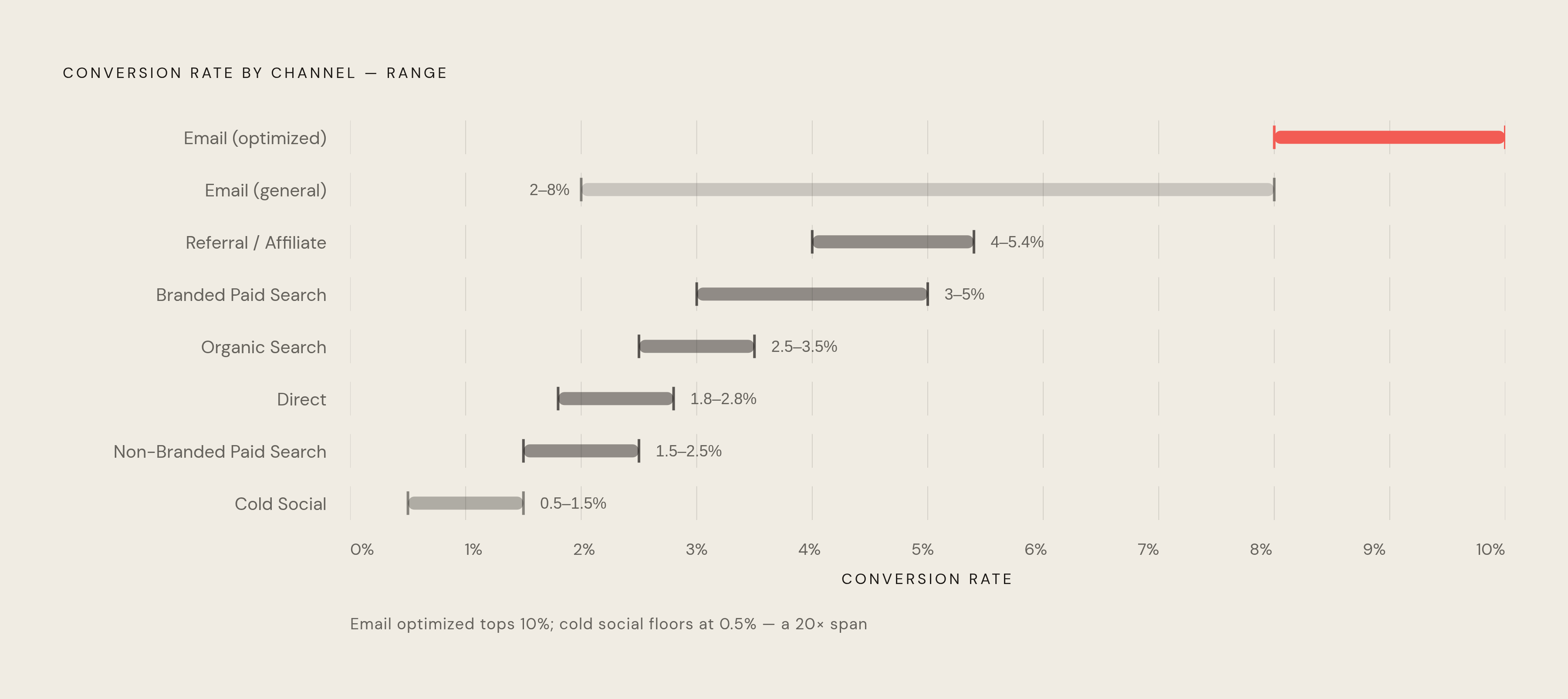
Two stores, same industry, same catalog, can report conversion rates that differ by 3x to 4x, and the entire gap can trace back to traffic mix alone. Industry benchmarks get all the attention. Where your visitors came from before they landed on your site shapes their odds of buying just as much as what you're selling them.
Referral and affiliate traffic sits at the top, converting between 4% and 5.4%. Makes sense once you think about what a referral actually is: someone else already vouched for you before the visitor clicked anything. Branded paid search runs close behind, 3.0% to 5.0%, because someone searching your brand name by name already knows who you are and is most of the way to buying. Organic search lands at 2.5% to 3.5%, filled with people actively hunting for a solution, even ones who'd never heard your name before Google handed it to them.
Email is the wildcard of the bunch. The range runs from 2% up to 8%, and optimized sequences, the kind with real segmentation and a list that's actually been cleaned in the last year, can hit 8% to 10%. That spread comes down almost entirely to list quality. A stale list full of people who signed up for a discount code back in 2022 behaves nothing like a freshly segmented list of last week's browsers. Direct traffic sits in the 1.8% to 2.8% range, a mixed bag of loyal repeat buyers and mid-funnel researchers typing your URL from memory because they forgot to bookmark it. Non-branded paid search runs 1.5% to 2.5%, since those clicks are still comparing options and haven't picked a winner.
Cold social, paid or organic, pick your platform, sits at 0.5% to 1.5%, consistently the weakest of the group. The ad interrupts a scroll instead of answering a question the visitor was already asking, and that's the whole reason it lags behind organic search, where the visitor typed the question themselves into the box.
Retargeting isn't a channel on its own so much as a multiplier stacked on top of whichever channel brought the visitor in the first time. Because these are people who already showed up once, lifts of 2x to 5x over cold audiences get reported constantly. Treat it as a boost you apply on top of your cold traffic numbers, not a separate line item to chase.
Abandoned cart email deserves its own callout, mostly because the number gets misquoted so often it's practically a rite of passage. Triple Whale's dataset, pulled from over 33,000 brands, found abandoned cart emails hit a 41.8% open rate and a 10.7% conversion rate. That 10.7% gets thrown around online like it's a general email benchmark, and it's worth pausing on why that's off: this is a recovery rate on an audience that already put items in a cart. They've shown intent. They just got distracted, or the shipping cost spooked them at the last second. Stack that 10.7% against a cold social rate of 0.8% and you're comparing a warm lead to a cold one and calling it a channel benchmark, which it isn't. Audit your traffic mix before trusting any sitewide number. A store running mostly cold social ads has no business measuring itself against a store built on email lists and branded search.
Device-level conversion rates and the mobile gap that is closing
Mobile makes up roughly 73% of ecommerce traffic, desktop the remaining 27%, and yet desktop still converts better: 3.2% to 4.3% on desktop against 1.82% to 2.8% on mobile, a gap of about 1.7x. Most shoppers, in other words, arrive through the exact channel that converts worst. That's a drag baked into just about every sitewide average out there, whether the store owner staring at the dashboard realizes it or not.
Checkout friction explains a lot of why the gap sticks around: more form fields crammed onto a smaller screen, autofill that half-works, tap targets easy to miss with a thumb. Trust signals get squeezed out too, since security badges, review counts, and return policy text all fight for space on a six-inch screen and usually lose that fight. Cart abandonment makes the friction visible in plain numbers. Overall cart abandonment averages around 70.22%, but split it by device and mobile runs 79% to 85% against desktop's 67% to 70%. People fill carts on their phones on the train home, then actually finish the purchase later, on a laptop, once the whole process feels less like a wrestling match.
That said, the gap is closing. Desktop and mobile conversion rates are trending toward roughly 2.8% each, real compression from what used to be closer to a 2:1 split. One-tap payment tools, Shop Pay, Apple Pay, Google Pay, are doing a lot of that work, along with checkout flows built mobile-first instead of ported over from desktop as an afterthought nobody budgeted time for.
That matters for anyone reading their own year-over-year numbers. A sitewide conversion rate that looks flat could be hiding a real mobile improvement, if traffic mix shifted just enough to cancel out the gain once everything gets blended together. You'd only catch that by breaking the report out by device instead of trusting the top-line number.
There's a seasonal wrinkle worth flagging too. Conversion rates peak in November, with a 2.27% peak recorded in November 2023, tracking with holiday shopping intent. But mobile abandonment spikes right alongside it, so desktop still ends up capturing a disproportionate share of holiday revenue relative to its shrinking slice of total traffic. The one month that should favor mobile the most still leans on desktop to actually close the sale.
Landing page conversion benchmarks and why they can't be compared to sitewide rates
Here's a number that trips people up constantly: the median landing page conversion rate sits at 6.6% across all industries, according to Unbounce's dataset covering 57 million conversions across 41,000 pages. That's nearly four times the global ecommerce sitewide average. Before anyone gets excited and starts wondering why their homepage doesn't perform like that, ask what's actually different about a landing page in the first place.
Quite a lot, it turns out. Landing pages strip out navigation, cut off exit points, and push toward one single action, none of the browsing detours a normal site hands you. The traffic reaching them is usually paid or email-driven, meaning it's pre-qualified before the page even finishes loading. And the "conversion" being measured is typically a lead form, an email signup, or a trial start, not a credit card charge. Those are lower-commitment asks than an actual purchase, so naturally the completion rate runs higher. Stack a 6.6% landing page rate against a 2% ecommerce sitewide rate and you're comparing two different kinds of commitment, not two versions of the same metric.
Within landing pages, the industry spread tells its own story. Events and Entertainment lead with a median around 12.3%. Financial services perform strongly too, sitting near the high end of the range. SaaS, oddly enough, comes in lowest in the Unbounce data, which cuts against the instinct that a digitally savvy audience should convert easily. To land in the top 25% of performers in any category, a page needs to clear roughly 11.4%, the 75th percentile floor across the whole dataset.
What separates the top performers from everyone else in this dataset is genuinely worth sitting with. Pages written at a 5th to 7th grade reading level convert at roughly double the rate of pages written at a college reading level. That's a hard pill to swallow for anyone in B2B or SaaS who reaches for technical language on instinct to sound credible; the data says simple wins, and it wins consistently. Traffic source matters here too. Pages fed by email traffic convert meaningfully higher than pages fed by other channels, which lines up with everything already covered in the channel section above.
The rule here is simple, even if it's easy to forget under deadline pressure: judge landing pages against landing page benchmarks, and stop there. Don't drag that number into a conversation about overall funnel health, and never stack it against a sitewide ecommerce figure. They're measuring different things wearing the same name tag.
Google Ads conversion benchmarks by industry
Paid search runs hotter than almost every channel we've covered so far. WordStream's 2025 analysis of over 16,000 U.S. campaigns puts the average Google Ads conversion rate at roughly 7.52% across industries, well above ecommerce sitewide figures. The metric measures click-to-conversion on traffic that already searched for something specific and clicked an ad that answered exactly that search. Pre-qualified doesn't quite cover it.
Some industries drag that average way up. Animals and Pets rank among the strongest performers in both the 2025 and 2026 WordStream datasets, hitting 16.22% in 2026. Automotive Repair, Services, and Parts sits close behind at 15.51% that same year. Education and Instruction posted some of the largest year-over-year gains in the 2025 data and landed as a top-three performer in 2026 at 13.14%. Physicians and Surgeons also perform strongly, which tracks with how specific and urgent that kind of search tends to be; nobody Googles a surgeon for fun.
At the other end, Finance and Insurance consistently posts the lowest conversion rates, down to 2.64% in 2026. Long consideration cycles, regulatory friction, and brutal competition all conspire to make each click expensive and each conversion hard to earn. Furniture sits near the bottom too, at 2.99% in 2026, dragged down by the forces you'd expect: high price tags, a need to sit on the thing before buying it, research that stretches over weeks instead of minutes. Career and Employment saw a notable decline in the 2025 dataset, worth watching if that's your industry.
The broader trend across both years points up: conversion rates rose for most industries year-over-year, in both the 2025 and 2026 datasets. Call it a recovery, though whether that holds up depends on what happens with ad costs next, and nobody's handing out guarantees on that front.
This brings up the half of this picture a conversion rate alone will never show you: cost per lead. A high conversion rate doesn't automatically mean an efficient campaign. Industries like Automotive and Pets often pair strong conversion rates with a comparatively low cost per lead, while other industries pay heavily for a fraction of the conversions. Attorneys, in particular, sit in a category where each click can cost enough that even a respectable conversion rate doesn't tell you whether the campaign made money. The rate answers one question; the cost answers a different one entirely. You need both before you can say a campaign is actually working.