Landing Page Copy Elements That Drive Conversion
Five landing page copy elements separate winners from the mediocre middle.
Landing pages convert at a median of 4.02%, per Unbounce's 2026 Conversion Benchmark Report, which pulled data from 41,000 pages. The spread behind that number is what should actually grab your attention: top industries land near 8.4%, the weakest hover around 3.8%, and the gap in between has less to do with luck than most marketers assume.
It's tempting to chalk that gap up to industry or budget or traffic quality. Financial services beating SaaS looks like an apples-to-oranges comparison at first, sure, different audience intent, different funnel fit. But copy quality sits on top of that baseline no matter what vertical you're in, and the 10% conversion rate people cite as "good" isn't some unreachable ceiling reserved for companies with bigger budgets. A page can more than double the median without touching a single design element, just by getting five things right: headline, subheadline, body copy, social proof, call to action. I want to walk through each one in the order a visitor actually hits them, because the order matters almost as much as the words themselves.
Why the headline carries more weight than all other copy combined
Copyblogger's often-cited figure says 8 out of 10 people read a headline, and only 2 out of 10 make it into the body copy. Ogilvy said something close to the same thing decades earlier, that five times as many people read the headline as read the rest of the ad. Different eras, different media, same ratio. That's not a coincidence so much as a pattern in how people triage information when they haven't decided yet whether something's worth their time.
So how much time are we actually talking about? Roughly 5 seconds, which is the window a visitor gives your page to prove it understands why they clicked. Miss that window and nothing else matters: the subheadline goes unread, the testimonials go unscanned, the CTA might as well not exist. Every section after this one is downstream of whether the headline lands.
None of this is about being clever. Wit doesn't do the job, and neither does a carefully workshopped brand voice. The headline has one task: answer the question every visitor is silently asking before they ask anything else, which is "is this for me?" A headline that dodges that, no matter how sharp the wordplay, has already lost the visitor before they scroll an inch.
What a high-converting headline actually says and how long it is
Length first, since it's the easiest thing to measure and the thing writers fight about most. Top-performing headlines average around 6 words, and close to 90% of high performers stay under 10. There's a mechanical reason for that: a visitor scanning in the first few seconds simply can't process a 20-word sentence, however elegantly it's built.
The Obama 2008 campaign donation page is probably the most picked-apart single-page copy test that exists, and it's worth sitting with for a second even now. The original converted at 8.26%. The winning variant, which changed only the headline and the CTA button, hit 11.6%, a 40.44% lift, estimated at around $60 million in additional donations. Same page, same offer, same donation form sitting right underneath. The only thing that moved was the words at the top, and that alone moved nearly half the conversion rate.
What made the winning version win was framing: outcome over feature, what the visitor gets over what the campaign was offering. "You get..." beats "We offer..." more often than not, because visitors care about what happens to them after the click, not what you built to get them there.
Headlines fail for a few reliable reasons. Jargon is one: nobody says "synergistic solutions" out loud in a normal conversation, yet it keeps showing up on landing pages like corporate language has its own gravitational pull. Generic openings are another. "Welcome" and "Our Services" are placeholders wearing a headline's clothes, and they answer nothing. Company-centric framing rounds it out, the instinct to lead with history or credentials ("Founded in 1987...") instead of whatever the visitor actually came looking for. All three share the same root problem: they're written from the company's point of view instead of the visitor's, and clarity moves conversion more reliably than any button color ever will.
How the subheadline and hero section answer the three questions every new visitor is silently asking
Every visitor lands asking three things, whether they'd put it in these words or not: what is this, is it for me, and what do I do next. The hero section, headline down through the CTA, exists to answer all three before anyone has to scroll.
The subheadline's job is narrower than most people treat it. It expands the promise or names the mechanism behind the claim, staying distinct from the headline instead of just restating it in slightly different words. If the headline says "Lose the muffin top," the subheadline might specify "a 12-week program built around 20-minute home workouts." That tells a skeptical visitor how the promise actually gets delivered, which the headline alone can't do.
Keep the whole value proposition under 30 words. That's roughly what a human eye can absorb in one scan before it starts to feel like reading an essay.
Now, message match, which is where a lot of otherwise well-written pages quietly fall apart. Say an ad promises "Breakthrough meditation system," and a visitor clicks expecting that exact phrase or something close to it. Landing instead on a headline that says "Welcome to Mindful Living Co." breaks something. Nobody consciously registers the mismatch; they just feel like they've wandered into the wrong room, and they leave. Message match has to hold across channels too, not just within a page. A visitor from paid search tends to already know their problem and is searching with intent; a visitor clicking a social ad is often just browsing, and needs a completely different opening hook for the identical offer underneath.
There's an old framework, AIDA, attention, interest, desire, action, that maps onto a hero section: headline grabs attention, subheadline builds interest, outcome framing creates desire, CTA delivers the action. The idea predates the internet by close to a century, and it's stuck around because it mirrors how people actually decide things: in order, patiently, top to bottom, not all at once.
Worth remembering: the hero section carries more weight than its size on the page suggests, because whatever sits below the fold only matters if the fold itself didn't already lose the visitor.
Why body copy at the wrong reading level costs more conversions than weak messaging does
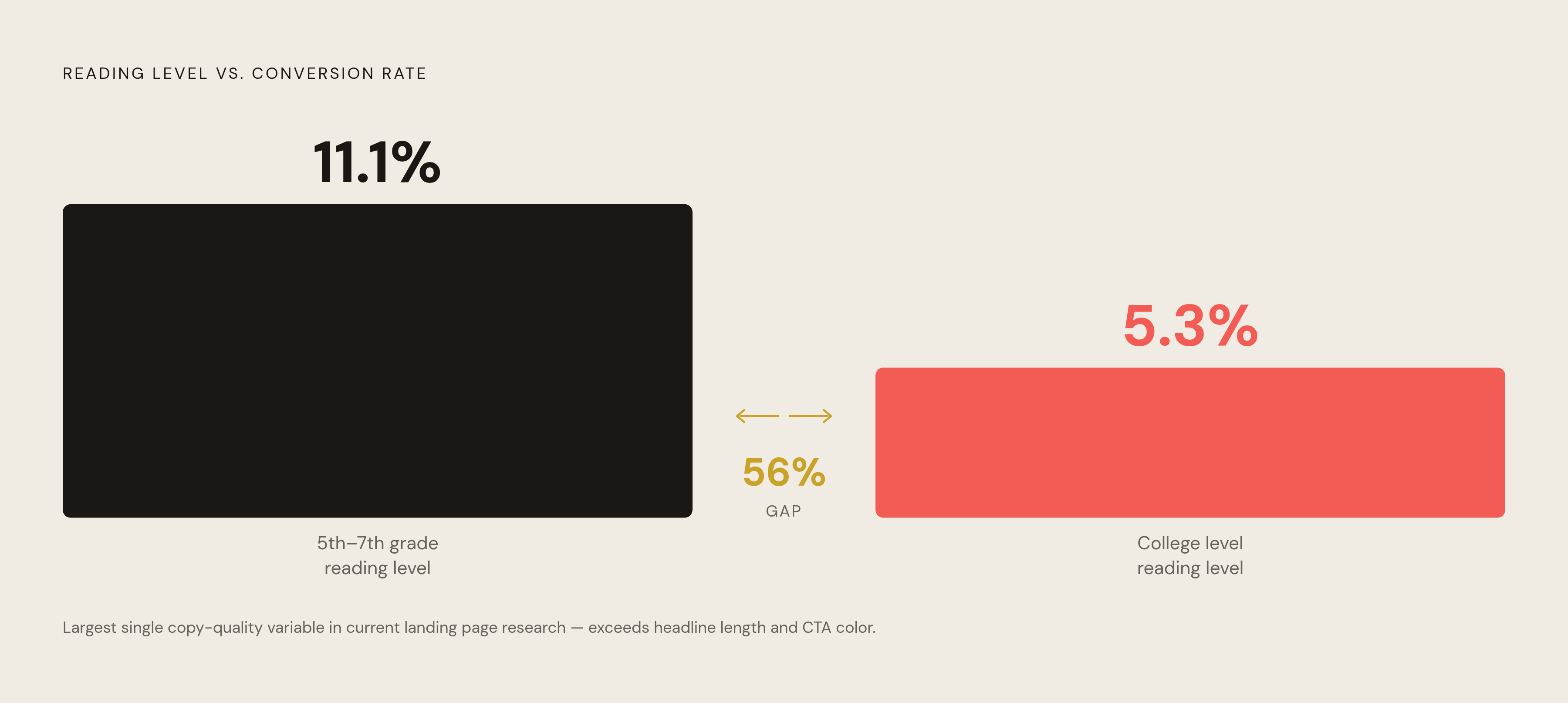
Here's a number worth sitting with for a second. Copy written at a 5th to 7th grade reading level converts at 11.1%. College-level copy, the kind stuffed with subordinate clauses and vocabulary that would feel at home in a dissertation, converts at 5.3%. That's a 56% gap, reportedly the single largest copy-quality variable in current landing page research, bigger than headline length, bigger than CTA color.
Before anyone gets defensive on behalf of their old English degree: this isn't about dumbing anything down. It's about cognitive load at the exact moment someone's deciding whether to hand you their email or their credit card number. Complex sentences eat working memory, and working memory spent parsing a semicolon-heavy paragraph is working memory not spent evaluating whether your offer is worth the trouble. Average attention span in 2024 sits around 47 seconds, which is roughly how long a visitor gives a page before deciding to stay or leave. Dense copy inside that window doesn't get read closely, and it gets abandoned instead.
People scan, hunting for anchors, phrases that feel like they were written for their exact situation, while everything else fades into the background. That should change how a page gets built: tight section headers, three to five benefit bullets per section (not two, not seven, somewhere in that band), short paragraphs, bold text used sparingly enough that it still means something when it shows up. Any paragraph past five lines starts to look, to a scanning eye, dense and skippable, regardless of how good the sentences inside it actually are.
There's a deeper question buried in here too, about why benefits beat features. Gerald Zaltman's research suggests something like 95% of purchasing decisions start on an emotional basis, with logic showing up afterward to justify what the gut already decided. Copy that leads with a feature (three fabric layers) hands the reader the job of doing the emotional translation themselves. Copy that leads with the benefit (stays dry for 10 miles) does the translation for them, and tucks the feature in one sentence later, once the reader's already leaning in.
If you write this stuff daily, run something like Hemingway or Flesch-Kincaid regularly on everything you publish, as a habit rather than a final check.
How social proof copy functions as third-party confirmation of every claim the page makes
Roughly 92% of consumers read testimonials before buying something, and yet most marketers still skip social proof on their landing pages entirely. Sit with that for a second: the thing customers say they want most before converting is the thing most commonly left off the page. Pages with customer reviews or testimonials convert 34% better, according to Invesp's 2024 data, which makes the omission look less like an oversight and more like money left sitting in plain view.
Social proof doesn't pull equal weight across formats, and this is where a lot of pages get lazy. Written testimonials are the most common and, ironically, often the weakest. "Great product, highly recommend!" from someone with no last name reads as filler, not evidence. Video testimonials outperform written ones by a real margin, mostly because a person talking on camera is harder to fake and harder to skim past in two seconds. Logos and aggregate counts, "12,000 businesses," "4.8 stars from 900 reviews," work on a different mechanism entirely: they're a glance-level trust signal, not a story, and they don't ask the visitor to read anything at all.
Specificity is what actually makes a testimonial convert: a named source with a title and company attached, an outcome stated in real numbers ("cut our support tickets by a third"), and some visible connection to the visitor's own situation. Vague praise from "J.S., Ohio" barely counts as social proof.
Placement carries as much weight as the content itself. A testimonial dropped right next to the exact claim it backs up does more work than the same testimonial buried three carousels down at the bottom. Here's a detail that should change how teams build CTA sections specifically: personalized CTAs placed next to social proof convert 202% better than generic ones sitting alone. Third-party trust and a specific next step compound each other, and neither one does much of anything by itself.
What CTA copy must say, and the word-level decisions that move conversion rates
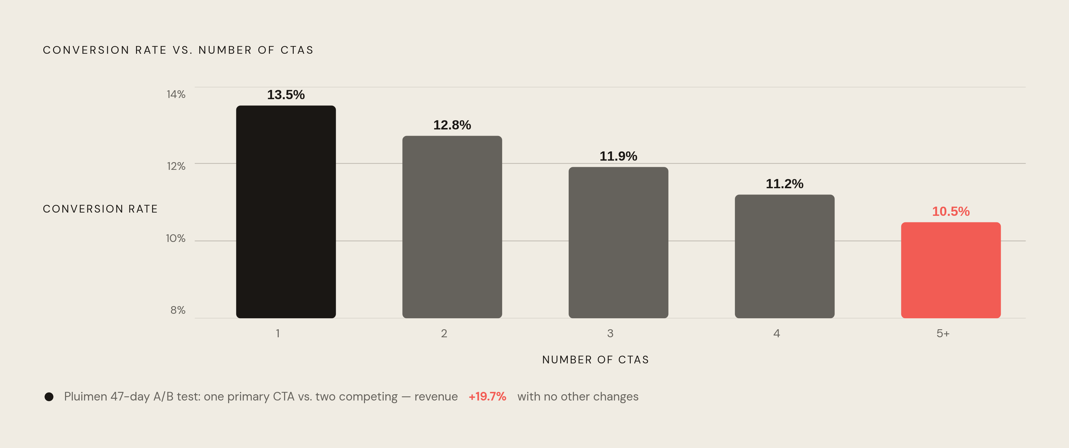
Pages with a single, clear call to action convert at 13.5%. That number drops as competing CTAs pile on, down to 10.5% on pages running five or more. Every additional button adds a decision point, and every decision point slows a visitor down.
Pluimen's case is the real-world version of that math. After a 47-day A/B test that replaced two competing CTAs with one primary CTA and stripped out unnecessary links, revenue rose 19.7%. Nobody touched the product page. Nobody rebuilt the checkout flow. They removed choices, and conversion went up, because a confused visitor doesn't slow down and convert more carefully; they just close the tab.
Button copy carries more weight than its size on the page would suggest. "Submit Form" tells a visitor what they have to do. "Get My Free Report" tells them what they get back, and the second version wins consistently because it centers the visitor's gain instead of their effort. Even tiny word swaps move the needle: changing "Start Your Trial" to "Start My Trial," second person to first, increased conversions by 90% in controlled testing. One word, doing a surprising amount of psychological work, because "my" implies ownership before the click has even happened.
High-converting CTAs average 3.41 words, and the three most common words across top performers are "Get," "Free," and "Now." Action, value, immediacy, roughly in that order. HubSpot's 2024 internal testing found "Download for Free" beat both "Download Now" and "Download the Free Template," which tells you something specific: naming the value outperformed naming the urgency on its own. Urgency still has a role; phrasing that implies a deadline can lift click-through meaningfully, but only when it's credible. A countdown timer that quietly resets on page refresh reads as a trick, not urgency, and it undoes whatever trust the testimonials above it just built.
Placement is its own decision, not an afterthought bolted on at the end. High-converting pages tend to run CTAs at three points: above the fold for visitors who arrived already sold, mid-page after a strong value statement for the ones still weighing it, and at the end for the methodical readers who want the whole page before committing to anything. None of those three should be a copy-paste of the first button. They're talking to three different mental states, and the wording should reflect that.
Reading the page as a system, not a checklist of parts
What gets lost when marketers treat this as a checklist is simple: every element only earns the right to do its job if the element before it already did its. The headline earns the subheadline's read. The subheadline earns the scroll into body copy. Body copy, paced right, earns the credibility that lets the testimonials land. The testimonials earn the click on the CTA. Break any single link in that chain and everything downstream goes quiet, no matter how well-crafted it is sitting on its own.
Message match runs underneath all of it, and it functions as a load-bearing wall for the whole page. Whatever promise the headline makes, the CTA has to deliver on that same promise, and any drift between the two opens a gap the visitor feels even if they couldn't name what's wrong. Nothing's technically broken, but something feels off enough that people leave before they act.
A useful way to check a page is in two separate passes. First, read each piece in isolation: does the headline do its job, does the CTA say what it needs to say? Then read start to finish, in order, and ask a different question entirely: does each piece earn the next one? A page can pass the first test cleanly and still fail the second, and that's usually the signature of a page built by committee, one solid section stitched to another solid section that doesn't actually lead into it.
Speed is worth remembering here too. The Obama campaign's 40.44% lift came from one test, run once, on one page. That doesn't mean every headline swap produces a windfall like that; most won't, but it does mean these are testable decisions, measured in days, not fiscal quarters. For teams leaning on AI tools to draft copy faster these days, that's arguably the more useful takeaway: knowing exactly what a headline or a CTA is supposed to accomplish is what turns a generated first draft into something worth shipping, something that reads like it was written by one specific person, for one specific someone else.
A landing page isn't done the day it goes live. It's done when the data shows each piece is actually earning its spot, and until that happens, every headline, every button, every testimonial on it is still a guess wearing a URL.